
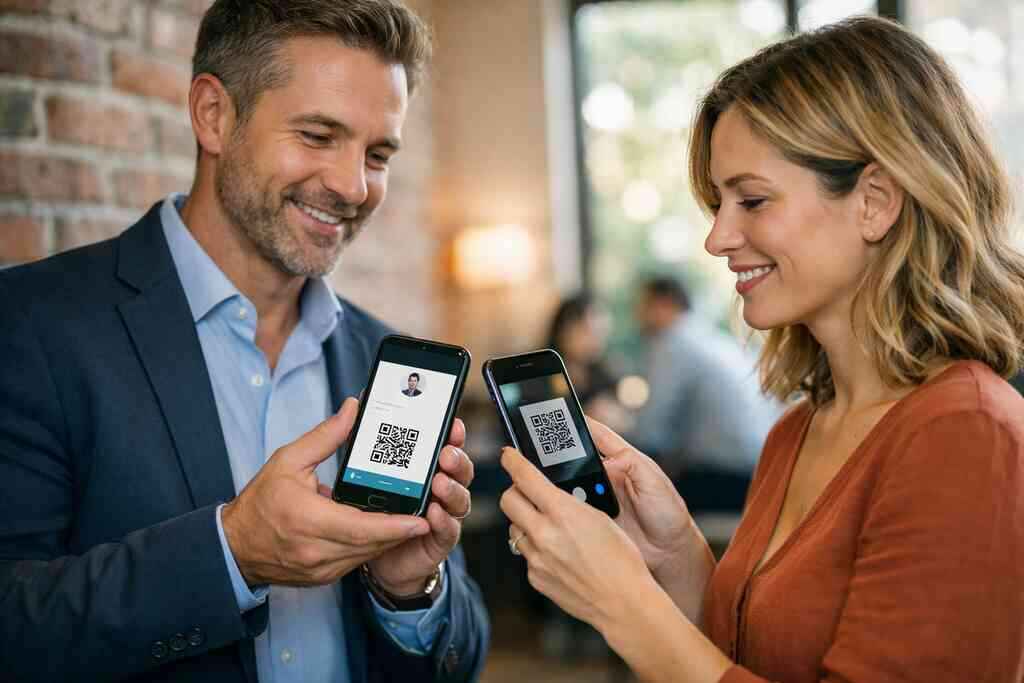
A lot of PPC budgets disappear before a single contact is saved. That stings, especially when your ad copy looked sharp and the click cost real money. If you have ever watched traffic land, hesitate, and vanish, you know the feeling. The problem is often not the ad. It is the landing page, where a digital business card should feel instant, local, and useful.
We hear this from professionals all the time. They want a digital business card, but they build a page that acts like a brochure. That gap kills momentum. On Long Island, where people move fast between client meetings, networking events, and commutes into NYC, slow pages lose trust quickly.
The fix starts with clarity. A digital business card PPC landing page optimization guide should do one thing well: help visitors share contact info without friction. That means your page must match the ad, the device, and the intent. If you miss any of those, the QR code may never get scanned.
Why most PPC clicks die on the landing page before the QR code ever gets scanned
The mismatch between ad promise and digital business card landing page reality
The first mistake is promise drift. Your ad may say “share contact info instantly,” but the landing page opens with vague language about modern networking. That gap feels small to marketers. It feels huge to visitors. People click because they want a simple outcome, not a lesson in virtual card design.
A digital business card landing page should mirror the ad’s language and intent. If the ad targets sales professionals, the page should speak to faster follow-up. If it targets real estate agents, it should show how a contactless share fits open houses and quick introductions. For freelancers, the value is often easy memory recall after a short meeting. For small business teams, it is faster lead capture with less manual work.
Here is the part most people miss. PPC visitors arrive with a short attention span and a specific problem. They are not browsing a portfolio. They are deciding if this online business card is worth another tap. If the page makes them think, they leave.
Why mobile visitors expect instant share contact info and hate extra taps
Most PPC traffic now lands on a phone. That changes everything. Mobile visitors expect the page to load fast, show the value fast, and let them act fast. Extra taps feel like work. Work kills curiosity.
A smart mobile-first landing page keeps the path short. It should say what the digital business card does, why it matters, and what happens next. The language should be plain, not clever. “Scan, save, connect” usually works better than abstract branding. That is especially true for QR code business cards and virtual business card campaigns.
One client in a Hauppauge business mixer asked why clicks were high but contacts were low. The page opened with a long story, then buried the scan button below the fold. We simplified the copy, moved the CTA up, and removed two optional links. The change was not glamorous. It was effective.
What Long Island businesses lose when the page looks like a generic online business card instead of a local offer
Generic pages do not feel local. That matters in Long Island, New York, where trust often starts with recognition. A page that could belong to any market feels detached. A page that speaks to Suffolk County, NYC commuters, or nearby networking feels credible.
Local language also supports click-through rate optimization. When a visitor sees language that fits Long Island digital marketing or NYC professional networking, they feel understood faster. That sense of fit improves contactless sharing for lead capture. It also reduces the chance they bounce before the QR or NFC action appears.
The loss is bigger than one missed scan. You lose the chance to frame your digital business cards as practical tools for paperless networking. You also lose the chance to show how the smart business card fits local work habits. On Long Island, that can mean the difference between a visitor who remembers you and one who forgets your name before lunch.
The page structure that turns a digital business card into a conversion funnel
The above-the-fold message that sells contactless sharing in one glance
Above the fold, you need one job: tell people what the page does and why they should care. That message should feel immediate. It should not ask for patience. It should offer a result.
A strong opening line for a digital business card landing page might focus on contactless sharing, lead capture, or instant contact exchange. Then add one supporting sentence for proof or clarity. If you can, mention the audience right away. Sales professionals, real estate agents, freelancers, and small business teams should each see themselves in the page. That is how you turn generic interest into intent.
Keep the visual focus simple. One hero image is enough. One button is enough. One clear benefit is enough. The more choices you give, the less likely people are to act.
How to place a create digital business card CTA without making the page feel pushy
A CTA should invite action, not pressure it. “Create digital business card” works when the visitor already understands the value. It feels pushy when the page has not earned the click. So place the CTA after a short value statement, not before it.
Use a sequence like this:
- State the problem.
- Show the benefit.
- Offer the action.
- Repeat the action after proof.
That structure works well for digital business cards for networking and lead generation. It also supports a digital card maker flow without overwhelming users. If you want more setup detail, a how digital business cards work for lead generation page can support the main CTA naturally. The key is to avoid making the page feel like a checkout gate.
Which trust signals matter for sales professionals, real estate agents, freelancers, and small business teams
Trust signals should be specific. Do not load the page with vague badges. Instead, show the signals that matter for the audience. Sales professionals want speed and follow-up. Real estate agents want easy sharing and polished presentation. Freelancers want personal branding. Small business teams want consistency.
A useful trust signal table can keep things clear.
AudienceBest trust signalWhy it worksSales professionalsLead capture and CRM integrationSupports follow-up automationReal estate agentsClean business card example and local relevanceMatches client-facing trustFreelancersCustom branding and simple designShows personality without clutterSmall business teamsConsistent digital card templatesKeeps the team alignedA strong page also respects proof without overclaiming. You can mention digital card analytics, but only if you can verify the reporting behavior. You can mention CRM integration, but only if the workflow is real on your platform. That restraint builds trust faster than hype.
What a high converting landing page actually needs before you spend a dollar on PPC
How to match your business card design to the search intent behind the ad
Search intent should shape design. If your ad targets “digital business cards for networking,” your page should feel polished and approachable. If the ad targets “QR code business cards for PPC campaigns,” the page should be direct and conversion-focused. Intent shapes everything from headline to layout.
The business card design should also match the way people search. Someone looking for an electronic business card usually wants convenience. Someone searching for an online business card may want a simple definition. Someone searching “how to make a digital business card” needs setup guidance and examples. Do not make them hunt for what they came to find.
On a recent campaign review, we saw a page that looked beautiful but answered the wrong question. Visitors wanted a fast explanation. The page offered a long brand story instead. Once we aligned the page with the search phrase, engagement improved because the user felt seen.
Why business card templates and digital business card templates should support one clear action
Templates should reduce decisions, not create them. A good business card template or digital business card template gives structure. It should guide users toward one clear action, like sharing contact info, scanning a QR code, or saving a profile. If the template offers too many paths, conversion drops.
This is especially true for corporate teams and SMBs. Teams often want multiple fields, multiple colors, and multiple links. That is understandable. But every extra field adds load. If your landing page wants a contact or a signup, the template should support that goal first.
The best digital business card platforms keep the template process simple. They make it easier to create digital business card layouts that look professional without slowing conversion. For design-heavy use cases, a templates page can help visitors choose faster. The page should feel like guidance, not a maze.
When custom branding helps and when it just slows the virtual business card conversion
Custom branding helps when it clarifies identity. It hurts when it distracts from action. That line is thinner than most teams think. Custom colors, logos, and fonts can reinforce memory. They can also slow a virtual business card conversion if they overpower the CTA. The right balance depends on the audience. Sales professionals may need a cleaner layout. Real estate agents may benefit from brand polish. Freelancers often need just enough personality to feel memorable. Corporate teams may need strict consistency. In every case, the user must know what to do next. 
If you are unsure, simplify first. Then test. That is the safest path. A digital business card features for high-converting landing pages page can help visitors understand which elements matter most without crowding the first screen. Keep the design useful, not decorative.
NFC, QR, and lead capture choices that change whether the click becomes a contact
When QR code business cards make more sense than NFC business cards for PPC traffic
QR code business cards often win for PPC traffic because they require less explanation. People already understand scanning. The behavior is familiar. It works on almost every modern phone. That makes QR a strong fit for landing pages where speed matters.
NFC business cards are useful too, but they can require more context. Visitors may wonder if their phone supports tapping, or whether setup is needed. If the page is cold traffic, that uncertainty can reduce conversion. For direct response campaigns, QR usually feels safer and faster. NFC can still work well once the visitor is farther down the funnel.
If you want a deeper comparison, the QR and NFC business card differences for SMBs discussion is a helpful reference point. QR codes align naturally with ISO/IEC 18004 standards, which gives the format a familiar, established structure. NFC aligns with tap-to-share behavior through standards like ISO 14443 and Apple’s Core NFC framework. The technology is solid. The question is how much explanation your traffic can handle.
How to explain electronic business card exchange in plain language without losing clicks
Plain language wins. Say what happens when someone scans or taps. Say what they get. Say how long it takes. If you have to explain the process like a software demo, the page is probably too heavy.
Try language like this:
- Scan to save contact details.
- Tap to share your card.
- Open a profile and connect in seconds.
- Send your digital card by link or email.
That language supports an electronic business card exchange without sounding technical. It also helps people understand the value of paperless networking. If the page needs more detail, use a short explainer below the CTA. Never make the first impression feel like documentation.
Where CRM integration, lead capture, and follow up automation fit in the funnel
Lead capture belongs after the user understands the value. Not before. If you ask for too much too soon, you lose casual interest. If you ask too late, you miss the moment. The best flow introduces value, then asks for contact details or a next action.
That is where CRM integration matters. If your digital business cards connect to a CRM, explain the benefit in human language. Say that the lead goes where your team already works. Say that follow-up becomes faster. Then connect that to business reality, not software jargon. A digital business cards for CRM integration and lead management resource can support that message for teams that need it.
Follow-up automation should be framed carefully. Do not promise what you cannot verify. Instead, explain that automated workflows can help teams respond sooner after a scan or form fill. That is enough. People want less manual work, not more vendor language.
Why digital card analytics matter when you are optimizing for Long Island, New York and NYC traffic
Analytics show behavior, and behavior shows friction. If one ad brings clicks but no scans, something is off. If one audience in Long Island converts better than another from NYC, that matters. Digital card analytics help you see patterns instead of guessing. That is where PPC gets smarter.
You may also find that device behavior differs by region. Long Island commuters may scan during downtime. NYC professional networking traffic may convert after a meeting. Suffolk County visitors may respond better to direct local cues. These are patterns, not promises, but they are useful patterns.
The article on digital business card analytics for lead capture and ROI can help you think through those metrics. Keep an eye on clicks, scans, form fills, and drop-off points. Numbers do not replace judgment. They sharpen it.
The decision that keeps your PPC landing page working after launch
How to test digital card pricing messages without promising free or premium plans you cannot verify
Pricing language can help or hurt. If you cannot verify free digital business card options, do not imply them. If premium digital card plans exist, do not oversell them without clear detail. Confused pricing messages create distrust fast. People often click away before they ask a question.
The safest path is to frame pricing honestly. Say that plans may vary. Say that users should review the options before committing. If you have a clear pricing page, link to it and let the visitor decide. That is more credible than vague savings talk. A digital business card pricing and plan comparison page is the right place for the details.
In our experience, the biggest mistake is trying to sound cheaper than you are. That almost always backfires. Visitors would rather see clarity than a teaser that feels slippery. Trust is part of conversion.
What to update on your page for Suffolk County, Long Island networking, and NYC commuter audiences
Local relevance should stay active after launch. Suffolk County audiences may care about community connections and easy follow-up. Long Island networking visitors may respond to speed and professionalism. NYC commuters often want a digital card that works on the move. Those needs shift, so your page should shift too.
Update examples, headlines, and proof points based on what the traffic tells you. A Garden City real estate agent, for example, may need a different angle than a Commack freelancer. The page should show local understanding without pretending to be hyper-specific where it is not. That balance keeps it honest.
Long Island, New York pages often perform better when they feel lived-in. Mention nearby settings only when they help the reader picture use in real life. A Hauppauge mixer, a Commack co-working space, or a Manhattan train platform can all signal real use. Just keep it natural.
When to send visitors to /how-it-works/, /templates/, /features/, or /pricing/ for the next move
Your landing page should not try to do everything. Sometimes the next best action is education. Sometimes it is design choice. Sometimes it is pricing review. Match the next click to the visitor’s readiness.
Use this simple routing logic:
- Send curious visitors to /how-it-works/.
- Send design-focused visitors to /templates/.
- Send feature-driven visitors to /features/.
- Send comparison shoppers to /pricing/.
That structure respects the buyer’s mood. It also keeps the main PPC page focused. If you need more context on setup flow, the how digital business cards work for lead generation page can guide the handoff. Do not force one page to answer every question.
Frequently Asked Questions
Do digital business cards work without an app?
Often, yes, depending on the platform and sharing method. Many digital business cards can be shared through a link or QR code without asking the recipient to install anything. That matters for PPC traffic, because fewer barriers mean more scans and fewer drop-offs. If you want the clearest explanation, start with the platform’s setup flow and share method. A well-structured how digital business cards work for lead generation page is usually the best place to verify this.
Can I customize the design of my digital card?
Usually, yes, but the depth of customization varies by platform. Some users only need branding basics, like colors, logos, and contact details. Others want more control over layout and messaging. For PPC, keep customization focused on conversion, not decoration. If you need a design reference point, a templates page can help you compare options.
Is NFC safe for sharing contact info?
NFC is a standard contactless technology, and it is widely used for data exchange. Safety still depends on how the card is set up and what information it shares. Keep the shared details limited to what you want visible. If privacy matters, review what your card sends before you deploy it. For deeper context, compare it with the platform’s QR approach and feature set.
What is better for PPC traffic, QR code business cards or NFC business cards?
For most cold PPC traffic, QR code business cards are easier to understand. They work on more devices and need less explanation. NFC can be excellent for face-to-face networking, but some visitors need more context before they tap. If your ad traffic is mixed, lead with QR and mention NFC as an option. That balance usually reduces friction.
How do I know if my landing page is converting well?
Watch three things: clicks, scans or taps, and completed lead actions. If clicks are high but scans are low, the page is probably unclear or slow. If scans are high but contacts are low, the CTA or form may need work. Digital card analytics can help you spot the drop-off point. If you want to track that more carefully, review your feature and analytics options.